
Picking a paint color can feel like a huge, overwhelming decision, especially when you’re staring at a wall of a thousand tiny swatches. The secret? Start with what's already in the room. Before you even think about heading to the paint store, take a good look at the things you can't easily change—your flooring, that big comfy sofa, or the kitchen countertops. This simple shift in perspective is the fastest way to narrow down your choices and guarantee a beautiful, cohesive result that saves you time and money.
Find Your Starting Point for the Perfect Color
The number one mistake homeowners, hosts, and even designers make is choosing their paint color first, completely in isolation. That perfect shade on a two-inch swatch looks wildly different covering four walls. The trick is to stop thinking about the paint itself and instead let the room's permanent fixtures guide your decision.
Think of these "fixed" elements as your built-in cheat sheet. Does your granite countertop have little flecks of warm gold, or is it shot through with cool gray? Is your brick fireplace a deep, rusty red, or does it have more muted, earthy taupe tones? These existing colors are the perfect foundation for your new wall color. Why does this matter? Because matching paint to fixed elements ensures harmony and saves you from costly repaints when a color unexpectedly clashes.
Pull Inspiration from What You Love
Another great strategy is to pick an "inspiration piece" from the room—something you absolutely love and want to highlight. This works in any space, from a high-end home to a cozy rental apartment.
- A vibrant area rug: Don't go for the most dominant color. Instead, pull a secondary, more subtle shade from the pattern for a really sophisticated look.
- A favorite piece of art: Using a soft background hue from the artwork as your wall color will make the art itself truly pop.
- A patterned throw pillow: Even a small item can give you a bold, confident color idea, especially for an accent wall.
This approach takes all the pressure off. You're not inventing a color scheme from scratch; you're simply building on what you already own and love.
Define the Mood of the Room
Beyond just matching colors, think about how you want the space to feel. The purpose of a room is just as important as its contents. Are you trying to create a serene, spa-like bedroom retreat? Or maybe a vibrant, energetic kitchen where everyone gathers? The mood you're after will naturally guide you toward the right color family.
Color psychology is a real thing, and it directly impacts how you feel in a space. For instance, blues and greens often create a sense of calm, making them perfect for bedrooms and bathrooms. Warmer tones like yellows and oranges can feel energetic and welcoming, which is great for kitchens and living rooms. Simply asking yourself if you want the room to feel cozy, airy, dramatic, or calm is a practical first step that makes the whole process easier.
This simple chart breaks down how to think about the process, starting with the big picture and slowly narrowing it down to a specific color.

This workflow stops you from getting lost in a sea of paint chips by focusing on function and feeling first. If you’re still having trouble picturing how different colors will actually look, AI-powered tools can be a game-changer. Our AI Interior Designer lets you upload a photo of your room and test drive dozens of paint colors and styles in seconds. It’s an amazing way to visualize your ideas before buying a single can of paint, saving you from expensive mistakes.
The Secrets of Light and Paint Undertones
Have you ever painted a swatch on your wall, stepped back, and wondered, “That looks nothing like it did in the store”? You’re not alone. This frustrating experience usually comes down to two culprits: the light in your room and the paint's hidden undertones. Getting these two things right is the single biggest secret to picking colors you'll love.
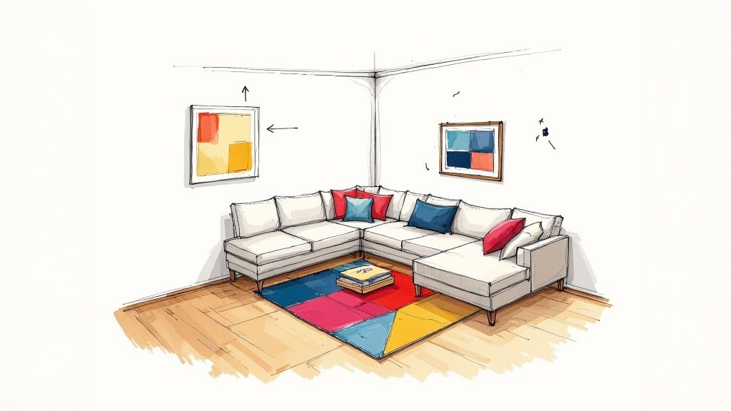
The light in your home isn’t a constant. It shifts from morning to night, and the direction your windows face plays a huge role in the quality of that light. This is why a color can look perfect in one room and completely wrong in another.
- North-Facing Rooms: Get cool, blueish light all day. To avoid a chilly feel, especially in family spaces, bring in warmer paint colors to create balance.
- South-Facing Rooms: Enjoy beautiful, warm, yellowish light most of the day. Most colors work well here, though intensely warm shades can sometimes feel overwhelming.
- East-Facing Rooms: Get bright, warm light in the morning that turns cooler in the afternoon. A versatile neutral often works best, as it can adapt to the changing light.
- West-Facing Rooms: The light is soft in the morning but becomes very warm—almost orange—in the late afternoon. This is great for making cozy living rooms feel even more inviting in the evening.
And don't forget your light bulbs! The warm, yellow glow of an old incandescent bulb will make a color look vastly different than a crisp, cool-toned LED. Always test colors under the exact lighting you'll be using.
Cracking the Code of Undertones
Now for the real game-changer: spotting undertones. These are the subtle, underlying colors that give a paint its unique character. That beautiful "greige" you picked out? It might have a sneaky pink, green, or even purple undertone that only reveals itself once it’s on your wall next to your sofa.
My Favorite Trick: To see a paint's true undertone, grab the swatch and place it on a piece of plain white printer paper. That stark white background makes the subtle warm (yellow, red) or cool (blue, green) hues pop, so you know exactly what you’re dealing with.
Ignoring undertones is why a "perfect" gray wall can suddenly make your beige carpet look dingy or your wood floors look orange. The goal is to pick a wall color with an undertone that complements the fixed elements in your room. For more on building harmonious palettes, check out the great articles over on the Interior Redesign AI blog.
Bringing It All Together Without the Mess
So, how do you juggle all of this? The traditional answer is to test, test, test. But buying dozens of sample pots gets expensive, messy, and time-consuming—a major headache for busy homeowners and property managers.
Instead of painting patches all over your walls, an AI interior design tool gives you the power to visualize changes instantly. You can just upload a photo of your living room and see how that specific shade of sage green looks with the morning sun streaming in versus under your favorite floor lamp at night. This eliminates decision stress and helps you move forward with confidence.
With Interior Redesign AI, you can try out countless paint colors on your actual walls in seconds. See how a cool blue plays with your warm wood floors or find the perfect neutral that doesn't clash with your stone fireplace. It ensures the final decision is one you'll be happy with for years to come.
Building a Cohesive Home Color Palette
So, you’ve nailed the perfect color for one room. That's a huge win! But now comes the real challenge: making sure your entire home feels connected, not like a patchwork of random design choices. A cohesive color palette is what makes a home flow beautifully from one space to the next—something that not only feels great to live in but also seriously boosts the appeal of a real estate or Airbnb listing.
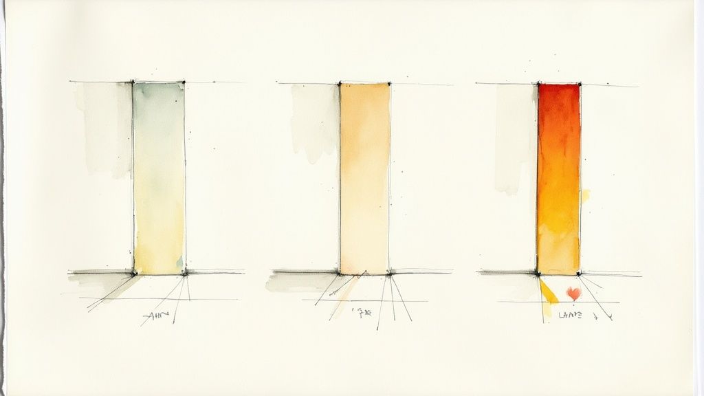
There's a classic designer trick for getting this right every time: the 60-30-10 rule. It’s a beautifully simple ratio that helps you layer colors in a way that feels balanced and intentional, not accidental.
Here’s the breakdown:
- 60% is your main color: This is your workhorse, usually the color on your walls. It sets the overall mood and acts as the canvas for everything else.
- 30% is your secondary color: This shade supports the main color. It appears on bigger pieces like a sofa, curtains, or maybe an accent wall.
- 10% is your accent color: These are the fun finishing touches! Think throw pillows, decorative objects, and artwork. This is where you inject personality.
Simple Color Schemes That Always Work
The 60-30-10 rule gets even easier when you start with a time-tested color scheme. You don't need a degree in color theory to get this right; these are just practical starting points that work in real homes, including small apartments and rentals.
- Monochromatic: For a serene, calming vibe, a monochromatic scheme is your best friend. This just means using different tints, tones, and shades of a single color. Imagine painting your walls a soft, light blue (your 60%), anchoring the space with a deep navy sofa (your 30%), and scattering in a few sky-blue pillows for that final 10% pop.
- Analogous: This scheme uses colors that are next to each other on the color wheel, like blue, green, and teal. It creates a rich, harmonious look that’s visually interesting without being jarring.
- Complementary: If you want a room with more energy, try pairing colors from opposite sides of the color wheel, like blue and orange. To keep it from feeling overwhelming, use more muted, sophisticated versions of these colors.
A Pro Tip for Real Estate & Rentals: Choosing a "whole-house" neutral is one of the smartest things you can do. Versatile neutrals like greige, soft white, or warm beige create a clean, spacious feeling that appeals to the widest range of potential buyers or guests. It gives them a blank canvas to imagine their own lives in the space.
From a Single Room to a Whole Home Palette
Ready to take this concept house-wide? Pick a palette of three to five colors and use them in different combinations as you move from room to room.
It’s all about varying the proportions. For example, the main 60% color in your living room could become a tiny 10% accent in the bedroom. This subtle repetition weaves a visual thread through your home, tying everything together without being too matchy-matchy.
Struggling to picture how it all comes together? Seeing is believing. Instead of second-guessing yourself, you can use a tool like Interior Redesign AI to test these color rules in your actual rooms. You can instantly see how a monochromatic blue bedroom might flow into a living room with complementary accents, giving you the confidence that your choices will be both cohesive and beautiful.
Visualize and Test Colors Without the Guesswork
Before you commit to gallons of paint, testing your top choices is absolutely non-negotiable. This single step saves people from frustrating and expensive do-overs. Please, don't rely on those tiny paint chips from the store. They’re fine for getting started, but they can be incredibly misleading once you bring them into your own space.
The color you see under the harsh fluorescent lights of a hardware store has no relationship to how it will look in your home. Paint is a chameleon; it changes its personality as the sun moves across the sky and as you flick on your lamps at night.
Test Colors the Right Way
To get a real feel for how a color will behave, you need to see it in a much larger format, right in the room where it will live. There are a couple of tried-and-true ways to do this.
- Paint large sample boards. This is my favorite method. Grab a few sample pots and paint them on large poster boards or pieces of foam core. The magic here is that you can move the boards all around the room. See how the color looks next to a bright window, what it does in a dark corner, and how it plays with your trim and flooring.
- Use peel-and-stick samples. These are a fantastic, mess-free alternative. You can buy large adhesive swatches from brands like Samplize, stick them on your walls, and move them around just like poster boards. This is perfect for renters who can't paint swatches on the walls.
Pro Tip: Always isolate your paint samples with white. If you place a swatch directly on top of your old wall color, your eyes will play tricks on you. Tape some plain white paper around the border of your sample to see the color's true undertones without the old paint influencing your perception.
Skip the Mess with Virtual Previews
What if you want to try out a dozen colors without running to the store for a dozen sample pots? This is where technology becomes an incredible ally, saving you a massive amount of time, money, and effort. Being able to see the final result instantly just melts away the stress and decision paralysis.
Here’s a quick look at how you can render a room in a new color using just a photo.
This shows just how easy it is to upload a picture of your own room and instantly see it reimagined with a new wall color, helping to eliminate any doubt before you start.
With an AI Interior Designer, you can upload a photo of your room and virtually "paint" your walls with hundreds of colors in just a few seconds. This lets you experiment with bold choices you might otherwise be afraid to try—like a deep navy accent wall or a sunny yellow kitchen—completely risk-free. You can see exactly how a color interacts with your actual furniture, curtains, and flooring. For a deeper dive into the features, you can always find more info in our support section.
While AI is a powerful tool for visualization, remember its limitations. It’s fantastic for generating ideas quickly but doesn’t replace your personal taste. Use it as a starting point, then combine the best ideas with your own intuition or the advice of a professional designer for the perfect result.
Common Paint Color Mistakes and How to Avoid Them
The fastest way to get your paint color right is by learning from the mistakes others have made. Understanding a few common pitfalls can save you a world of frustration and the cost of a repaint.
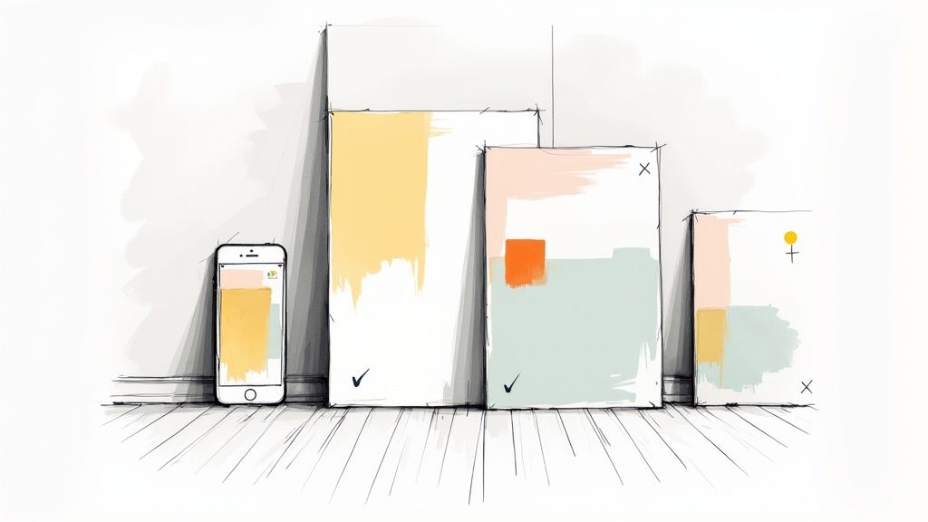
One of the biggest blunders is falling for a color that's far too saturated. That brilliant sapphire blue that looks so captivating on a tiny paint chip can easily become an overpowering nightmare when it’s covering every wall. The color that seemed exciting in the store can end up making a room feel small and chaotic.
The Hidden Culprits: Undertones and Finishes
Another classic trip-up is completely ignoring undertones. This is the sneaky reason why your beautiful beige sofa suddenly looks strangely pink next to your new "greige" walls. It happens when the cool undertone in your wall paint clashes with the warm undertone in your sofa's fabric. You have to put your swatches right next to your key furnishings—sofas, rugs, curtains—and see how they play together.
The paint finish you choose is just as important as the hue itself, but it's a detail people often forget. The wrong sheen can create daily headaches, especially for families or rental properties.
- Matte or Flat: This finish is gorgeous and velvety, a master at hiding minor wall imperfections. But—and this is a big but—it’s the least durable. Put it in a busy hallway, and you’ll have a permanent collection of scuffs that you can't wipe away. Best for low-traffic areas like adult bedrooms or ceilings.
- Eggshell or Satin: Think of this as your reliable workhorse. It offers a soft, subtle sheen that's durable enough to be gently cleaned, making it the go-to for most living rooms, bedrooms, and family spaces.
- Semi-Gloss or Gloss: With its noticeable shine, this finish is built for toughness. It can withstand scrubbing and moisture, which is why it's perfect for trim, doors, and hardworking areas like bathrooms or kitchen backsplashes.
The Virtual Fix for Common Errors
Feeling nervous about getting it wrong? This is exactly where modern tools can take the guesswork out of the equation. Instead of just hoping that a saturated color won't be too much or that the undertones won't clash, you can actually see the result before you buy paint.
Imagine this: with an AI tool, you can instantly see how that daring emerald green will look on all four walls. You can test whether that tricky greige makes your beautiful oak floors look muddy and orange. It’s like having a design crystal ball that saves you from costly mistakes.
This kind of virtual test run helps you dodge expensive repaints and the disappointment of a color that just doesn't work. It gives you the freedom to experiment with hundreds of shades without any commitment, ensuring the color you finally choose is one you’ll be happy with for years.
Answering Your Top Paint Color Questions
Even after you've done your homework, a few last-minute questions always seem to pop up. Let's walk through some of the most common ones I hear from homeowners and real estate agents, so you can move forward with confidence.
Knowing the answers to these questions helps you sidestep common pitfalls and make smart, practical decisions you won't regret later.
What Are the Trendiest Paint Colors Right Now?
It's always fun to see what's trending, but remember that the best color is one that works for your specific space. While timeless neutrals will never go out of style, people are definitely embracing more personal, expressive colors. Recent insights from Pinterest really shine a light on this shift.
Based on what users are searching for, colors like Cherry Red, Butter Yellow, and a moody Aura Indigo are having a major moment. Searches for "Cherry Red walls" have shot up, signaling a craving for more joyful, personality-packed spaces. You can see the full breakdown of these color trends on Pinterest Business. But for real estate listings or Airbnbs, sticking to sophisticated, crowd-pleasing neutrals is usually the safest bet.
Should I Paint My Ceiling White?
You don't have to! Painting the ceiling is one of the most underrated design tricks in the book. A crisp white ceiling can certainly make a room feel taller, but it's far from your only choice.
- For a cozy, enveloping feel: Try painting the ceiling the same color as the walls. This creates a seamless, intimate vibe that works wonders in bedrooms and dens.
- To add drama: A dark ceiling in an otherwise light room makes a sophisticated statement, especially if you have high ceilings.
- For a subtle, cohesive look: Go for a much lighter version of your wall color—just a few shades up on the same paint strip. It connects the space beautifully.
How Many Paint Colors Are Too Many for One House?
There isn't a single magic number, but a great rule of thumb is to build a "whole-house" palette of three to five colors. This approach is the secret to making your entire home feel connected and thoughtfully designed, which is a huge selling point.
Here’s a simple way to build that palette:
- A primary neutral: This is your go-to for hallways, entryways, and large, open living spaces.
- A secondary neutral: Think of a slightly different neutral—maybe a bit warmer or cooler—to add variety in bedrooms or a home office.
- One or two accent colors: These are your bolder shades. Use them for an accent wall, on interior doors, or to make a statement in a small powder room.
This framework gives you plenty of room for personality while ensuring the entire home flows together. If you have more specific questions, feel free to browse our comprehensive FAQ page for more detailed answers.
Key Takeaway: The "perfect" color is simply the one that works best for your home, your light, and your life. A color that looks incredible on Instagram might fall flat in a room with different lighting or clashing floors.
At the end of the day, choosing paint should be one of the most exciting parts of designing your home. When you combine practical, real-world testing with smart visualization tools, you can finally ditch the guesswork and confidently create a space that feels like you.
Ready to stop guessing and start visualizing? Try Interior Redesign AI to instantly reimagine your room from a photo or sketch and find your perfect paint color in seconds. Get started now at https://www.interiorredesignai.com.