
A white house is a timeless canvas, offering endless possibilities for personality and style. But the secret to unlocking its full potential often lies in the details—specifically, the trim color. The right trim can elevate your home from simple to stunning, defining its architectural lines and reflecting your personal taste. This choice is a key driver for anyone interested in creating curb appeal, significantly enhancing your home's exterior aesthetic.
Whether you're a homeowner planning a refresh, an Airbnb host aiming for more bookings, or a real estate agent staging a property to sell, choosing the perfect trim color is a high-impact upgrade that makes all the difference. The right shade frames your home's features, from windows to gables, creating a polished and intentional look that captures attention. From classic black to soft sage green, the trim is where you can truly define your home's character.
But with so many options, from bold contrasts to subtle neutrals, how do you choose? Decision fatigue is real, and the fear of picking the wrong shade can be paralyzing. That's where this guide comes in. We've curated a list of the most effective and stylish trim color ideas for a white house, complete with practical tips for each. We’ll also show you how you can skip the guesswork and messy sample pots by using an AI interior design tool to instantly visualize these combinations on your own home, saving you time, money, and stress. Let's find the perfect palette to transform your exterior.
1. Charcoal Gray Trim
Charcoal gray trim offers a sophisticated, modern alternative to classic black-and-white schemes. This trim color idea for a white house provides a refined look, creating a subtle yet impactful frame that enhances your home’s architectural details without overwhelming them. It bridges the gap between bold and conservative, making it exceptionally versatile for various exterior styles, from modern farmhouse to contemporary.
Unlike stark black, charcoal gray has a softer edge that feels more integrated with the landscape. It delivers a contemporary aesthetic that is both timeless and on-trend. For real estate agents and Airbnb hosts, this choice signals a high-end, professionally designed property that appeals to a wide range of buyers and guests, boosting its listing appeal.
Why It Matters for Your Space
Charcoal gray provides a "soft contrast" that highlights windows, door frames, and rooflines with precision. This deep, muted tone pairs beautifully with a wide spectrum of white siding, from crisp, cool whites to warmer, creamier off-whites. Its neutrality also complements various materials, such as natural stone, warm wood accents, and metal roofing, making it a practical and aesthetically pleasing choice that boosts curb appeal and perceived value without the harshness of pure black.
Expert Insight: The magic of charcoal gray lies in its complexity. Depending on the light, it can read as a soft black, a deep slate, or a rich graphite. This dynamic quality adds visual interest and depth to your home's facade throughout the day.
How to Get the Look
Getting this look right involves paying attention to sheens, undertones, and pairings. A successful application ensures a cohesive and professionally finished appearance.
- Pair with the Right White: For a balanced look, pair charcoal trim with warm whites like ivory or cream. Cool, stark whites can sometimes create a contrast that feels too cold.
- Choose the Right Finish: A matte or eggshell finish is ideal. These low-sheen options absorb more light, enhancing the color's richness while minimizing surface imperfections—a great tip for older homes.
- Coordinate Exterior Elements: Extend the charcoal color to your shutters, garage doors, or even the front door for a unified design. Complement the look with brushed nickel or matte black hardware for a modern touch.
Instead of buying multiple sample pots, you can instantly see how charcoal gray will look on your home using an AI tool like Interior Flux Studio AI. Upload a photo of your house, and the AI lets you "paint" the trim and test different white siding undertones. This step eliminates guesswork, helping you avoid costly mistakes and ensuring you love the final result, saving both time and money.
2. Classic Black Trim
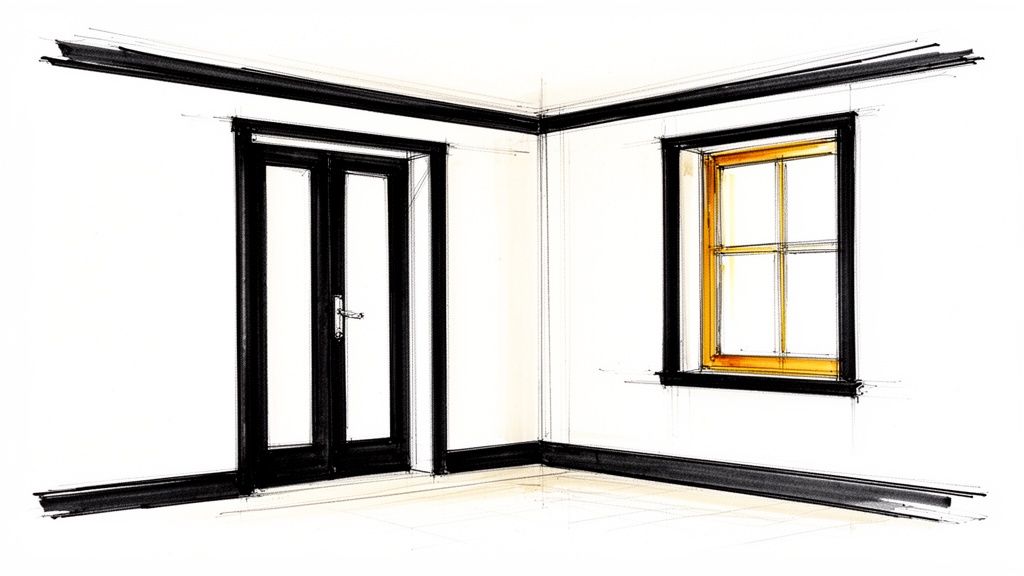
Classic black trim creates a dramatic, high-contrast look that provides sharp architectural definition against a white house. This timeless pairing has seen a major resurgence, becoming a hallmark of modern farmhouse, industrial, and transitional styles. Choosing black trim is a bold move that elevates trim work from a subtle detail into a powerful design feature.
The stark contrast makes windows pop, frames doorways with intention, and gives rooflines a crisp, graphic quality. This is one of the most impactful trim color ideas for a white house, delivering a clean, confident aesthetic that feels both classic and current. For real estate listings or Airbnb photos, this high-contrast look stands out online, grabbing attention and making the property memorable.
Why It Matters for Your Space
Black trim provides the ultimate contrast, making every architectural line it borders stand out with unparalleled clarity. This graphic effect highlights the home's structure and form, drawing attention to windows, gables, and entryways. The black-and-white combination is a versatile foundation that pairs seamlessly with a wide array of accent materials, including red brick, warm wood tones, and sleek metal elements. This powerful color scheme significantly enhances curb appeal, creating a memorable and high-end impression.
Expert Insight: The success of black trim lies in its ability to create a "picture frame" effect for your home's windows. This not only enhances the exterior view but also frames the view from the inside, making your windows feel like living works of art.
How to Get the Look
Achieving a sophisticated black-and-white exterior requires careful consideration of the specific shades, finishes, and application to avoid a look that feels too harsh.
- Pair with the Right White: To soften the high contrast, pair black trim with a warmer, creamier white. Stark, cool whites can create an overly severe appearance.
- Choose the Right Finish: A satin or semi-gloss finish is excellent for black trim. These sheens provide durability and are easy to clean, while offering a subtle reflection that keeps the color from looking flat.
- Create a Cohesive Design: For a unified look, consider painting the front door, shutters, and garage doors black as well. This repetition creates a deliberate and polished design scheme.
- Ensure Clean Lines: Crisp, perfect lines are non-negotiable with black trim, as any mistake will be highly visible. Use high-quality painter's tape for a professional-grade finish.
Visualizing such a bold choice is critical before you commit. You can use an AI tool like Interior Flux Studio AI to instantly apply black trim to a photo of your house. It lets you experiment with different white sidings and see how the combination looks in high-quality renderings, ensuring the final result is exactly the dramatic, polished look you envision, reducing decision stress.
3. Warm Beige or Cream Trim
Warm beige or cream trim offers a layered, monochromatic look that enhances a white house with gentle sophistication. This trim color idea for a white house moves away from stark contrast, instead creating a soft, cohesive aesthetic that feels both inviting and elegant. It wraps the home in subtle warmth, adding depth and architectural definition without sharp lines.
This approach is perfect for traditional, transitional, and cottage-style homes, where the goal is to create a timeless and welcoming facade. Unlike high-contrast options, a warm beige or cream trim fosters a seamless transition between the siding and details. The result is a harmonious, light-filled exterior that appears thoughtfully curated—a major plus for family homes and charming rental properties.
Why It Matters for Your Space
A warm beige or cream trim introduces just enough color to prevent an all-white scheme from feeling flat or sterile. This subtle tonal variation highlights architectural features in a graceful, understated manner. It pairs beautifully with warm whites that have yellow, pink, or golden undertones, creating a rich, dimensional look. This combination also complements natural materials like stone and warm wood, making it a versatile and budget-friendly choice that works with existing features.
Expert Insight: The success of a beige or cream trim lies in its ability to soften the light. While a crisp white trim can create sharp reflections in bright sun, a warmer off-white absorbs light differently, giving the home a gentle, welcoming glow.
How to Get the Look
Achieving this layered effect requires careful color selection to ensure there is enough distinction between the siding and the trim.
- Ensure Sufficient Contrast: Select a cream or beige that is noticeably darker or warmer than your white siding. When viewed from a distance, the colors should appear distinct, not blended.
- Choose the Right Finish: A matte or eggshell finish on the trim enhances the color's softness and minimizes imperfections. This low-sheen look contributes to a more organic and high-end feel.
- Mind the Undertones: Pair your white siding with a cream or beige that shares a similar undertone (e.g., a warm white with a yellow-based cream). This creates a more cohesive, professionally designed appearance.
- Coordinate with Natural Materials: This look is especially effective on homes that feature warm wood doors, copper gutters, or warm-toned stone or brick accents.
Visualizing the subtle difference between two shades of white can be challenging. You can use an AI design tool like Interior Flux Studio AI to test multiple beige and cream trim options against your specific white siding. The tool allows you to upload a photo and instantly see how the undertones interact in different lighting, helping you choose the perfect warm pairing with confidence.
4. Soft Sage Green Trim
Soft sage green trim offers a gentle, nature-inspired accent that brings a sense of calm to a white house. This subtle, earthy hue provides a refreshing alternative to more traditional neutrals, adding personality and organic elegance. It beautifully frames a home's architecture, creating a soft, welcoming aesthetic that connects the structure to its natural surroundings.
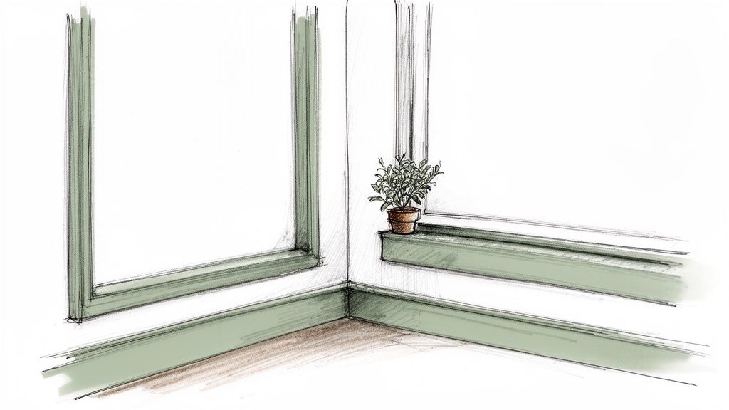
This trim color is perfect for cottage-style homes, modern farmhouses, and coastal properties where a connection to the landscape is key. Unlike brighter greens, soft sage is muted and sophisticated, providing a hint of color that feels both timeless and grounded. For an Airbnb, this can create a "peaceful retreat" vibe that is highly marketable.
Why It Matters for Your Space
Soft sage green creates a harmonious, low-contrast pairing with white siding, which is ideal for highlighting architectural features without sharp lines. Its gray undertones ensure it acts as a sophisticated neutral, complementing a wide range of materials like warm wood, natural stone, and slate roofing. This color choice is a fantastic way to introduce a unique personality to your home's exterior while maintaining a classic, elegant curb appeal that appeals to buyers and renters alike.
Expert Insight: Sage green is a "chameleon color" that shifts beautifully with the light. In bright sun, it appears lighter and more ethereal, while in the shade, its deeper, earthier tones become more prominent, adding complexity and visual depth.
How to Get the Look
Achieving a polished, serene look with sage green involves selecting the right shade and finish to create a cohesive exterior palette.
- Pair with Warm Whites: To enhance its organic feel, pair soft sage green trim with warm or creamy off-whites. A stark, cool white can sometimes make the green feel washed out.
- Choose a Muted Tone: Opt for a sage green with gray or beige undertones rather than a bright, saturated mint. Muted tones provide a more sophisticated and enduring look.
- Select a Soft Finish: An eggshell or satin finish complements the gentle nature of sage green. These sheens offer a subtle luster that feels organic and avoids a high-gloss appearance.
- Harmonize with Nature: Enhance the look by coordinating the trim with landscaping choices. Incorporate plants with silvery-green foliage, like lavender or eucalyptus, to create a seamless connection between your home and garden.
Visualizing how a specific shade of sage will look against your white siding is essential. You can instantly test this trim color idea for a white house with Interior Flux Studio AI. Just upload a photo of your exterior, and our AI tool allows you to apply various sage greens to your trim, shutters, and doors, helping you find the perfect shade without any guesswork.
5. Soft Gray-Blue Trim
Soft gray-blue trim offers a serene and sophisticated trim color idea for a white house, infusing a sense of calm and coastal elegance. This nuanced color brings a gentle whisper of the sky and sea to your home's exterior, creating a look that is both refreshing and timeless. It provides a subtle departure from standard grays, adding a layer of depth and personality that feels custom and thoughtfully chosen.
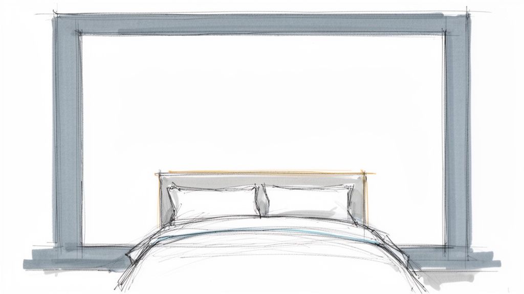
This tranquil hue is a hallmark of coastal, modern Scandinavian, and contemporary farmhouse aesthetics. It suggests a relaxed yet polished atmosphere, perfect for homeowners wanting to create a peaceful retreat or for an Airbnb property in a vacation spot. Unlike more vibrant blues, a soft gray-blue acts as a near-neutral, making it incredibly versatile.
Why It Matters for Your Space
A soft gray-blue trim provides a delicate, low-contrast frame that beautifully complements white siding without creating harsh lines. The blue undertone cools down the overall palette, making it ideal for homes in sunny climates. It pairs exceptionally well with natural materials like light-colored stone, weathered wood, and galvanized metal accents. This gentle color scheme boosts curb appeal by creating an inviting and harmonious facade that feels welcoming to all.
Expert Insight: The beauty of soft gray-blue is its chameleon-like quality. In the bright morning sun, it appears as a light, airy blue, while in the evening shade, it deepens into a more complex, moody gray. This subtle shift adds dynamic visual interest throughout the day.
How to Get the Look
Achieving a balanced and elegant look with gray-blue trim requires careful consideration of the specific white siding and surrounding elements.
- Pair with the Right White: Complement a soft gray-blue trim with a crisp, cool white to enhance its blue undertones. Warmer, creamier whites can sometimes make the blue appear muted.
- Choose the Right Finish: An eggshell or satin finish is perfect for this color. These sheens offer a slight luster that catches the light beautifully without being overly glossy, and they provide good durability for exterior surfaces.
- Coordinate Exterior Elements: Create a cohesive look by painting shutters or the front door in a slightly deeper shade of the same gray-blue. Brushed silver or light bronze hardware pairs wonderfully with this color palette.
You can instantly visualize how a soft gray-blue will look on your home using an AI design tool like Interior Flux Studio AI. Upload a photo of your house, and the AI lets you "paint" the trim and test different shades. This step removes the guesswork, ensuring you select the perfect hue for your dream exterior and avoid a costly repaint.
6. Deep Charcoal-Navy Trim
Deep charcoal-navy trim introduces a layer of refined complexity to your home's exterior, blending the grounding stability of charcoal with the subtle richness of navy blue. This sophisticated trim color idea for a white house offers more depth and personality than a standard gray or black. It creates a crisp, architectural definition that feels both modern and enduringly elegant.
This nuanced shade moves beyond predictable palettes, offering a bespoke, designer-forward feel. While it commands attention, its deep, muted quality prevents it from becoming overpowering. It is an excellent choice for contemporary luxury homes, updated modern farmhouses, and transitional-style properties seeking a color with a sophisticated, moody undertone that remains classic.
Why It Matters for Your Space
Charcoal-navy provides a high-impact yet graceful contrast against a white facade. The subtle blue undertones come alive in natural light, adding visual intrigue that shifts throughout the day. This complexity allows it to pair beautifully with a range of materials, from cool-toned stone and slate to the warmth of natural wood doors or copper gutters. It elevates the home's exterior, giving it a custom-designed appearance that significantly boosts curb appeal for a higher property valuation.
Expert Insight: The allure of charcoal-navy is its chameleon-like quality. In the bright sun, the navy notes become more apparent, offering a hint of color. In the shade or on an overcast day, it reads as a rich, soft black, providing dynamic character.
How to Get the Look
A successful application of charcoal-navy hinges on balancing its cool undertones and selecting complementary elements to create a cohesive exterior design.
- Pair with the Right White: To prevent the facade from feeling too cold, pair charcoal-navy trim with a warm or neutral white siding. A white with creamy or soft beige undertones will balance the cool blue in the trim.
- Choose the Right Finish: A satin or semi-gloss finish will give the trim a subtle sheen, which helps reflect light and highlights the color's sophisticated depth. This finish is also more durable and easier to clean.
- Coordinate Exterior Elements: Create a unified look by extending the charcoal-navy to shutters, the front door, or garage doors. This color pairs exceptionally well with brass or brushed gold hardware, which adds a touch of warmth and luxury.
You can eliminate the uncertainty by visualizing this unique color on your home with Interior Flux Studio AI. Upload a photo of your exterior, and our AI tool lets you instantly apply deep charcoal-navy to your trim, shutters, and doors. This allows you to see exactly how it interacts with your specific white siding and lighting conditions, ensuring you make a confident and stylish choice.
7. Pure White Trim (High-Quality, Crisp White)
Pairing high-quality, crisp white trim with white walls creates an exceptionally clean, cohesive, and sophisticated monochromatic look. This trim color idea for a white house relies on subtle variations in sheen to define architectural elements. This minimalist approach is a hallmark of Scandinavian, contemporary, and modern designs, where it emphasizes clean lines, structural simplicity, and a feeling of spaciousness.
The white-on-white scheme elevates a home’s exterior by creating an uninterrupted, seamless canvas that feels both serene and luxurious. It draws attention to the form and texture of the house itself. This look is perfect for homeowners who appreciate understated elegance and want a timeless facade that feels bright, airy, and impeccably polished, which can make a smaller home feel larger and more valuable.
Why It Matters for Your Space
The success of a white-on-white exterior lies in its nuance. By using different finishes, such as matte for the siding and a satin or semi-gloss for the trim, you create a subtle play of light and shadow that gently outlines the home's features. This technique adds depth and dimension without introducing a new color, resulting in a look that is layered and intentional. The effect is particularly striking in abundant natural light, where the different sheens become more apparent.
Expert Insight: A common misconception is that all whites are the same. A successful white-on-white palette often involves pairing a slightly warmer white for the siding with a crisper, purer white for the trim. This subtle temperature difference provides just enough definition to prevent the facade from looking flat.
How to Get the Look
Achieving a high-end monochromatic look requires precision and attention to detail. The key is in the quality of the paint and the strategic use of finishes.
- Vary the Sheen: This is the most critical step. Use a flat or matte finish on the main siding to hide imperfections and create a soft look. Apply a satin or semi-gloss finish to the trim, fascia, and window frames to catch the light and create a crisp outline.
- Select Complementary Whites: Choose two distinct whites. For instance, pair a soft, slightly off-white siding like Benjamin Moore’s White Dove with a brighter, cleaner trim like Chantilly Lace. This prevents the exterior from appearing sterile.
- Invest in Premium Paint: For a white-on-white scheme, paint quality is paramount. High-quality paints offer better coverage, durability, and color retention, ensuring your white stays true and doesn't yellow over time.
You can explore different white pairings and sheen combinations effortlessly using an AI tool like Interior Flux Studio AI. Upload a photo of your home and instantly visualize how a satin trim looks against matte siding or compare a cool white trim with a warmer white body to find the perfect nuanced combination for your home, saving you from a potentially flat result.
8. Warm Taupe Trim
Warm taupe trim offers a sophisticated and inviting alternative to starker neutrals, blending the earthiness of beige with the quiet elegance of gray. This trim color idea for a white house creates a soft, welcoming frame that adds depth and character. It’s a refined choice that moves beyond basic neutrals, providing a look that is both classic and contemporary, making it ideal for transitional and modern traditional homes.
This versatile neutral brings a gentle warmth to a white exterior, preventing it from feeling too sterile or cold. Warm taupe has a grounding effect that connects the home to its natural surroundings, pairing beautifully with stone, brick, and lush landscaping. It is an excellent choice for homeowners seeking a timeless, high-end look that feels both luxurious and comfortable.
Why It Matters for Your Space
Warm taupe provides a subtle, low-contrast definition that gracefully outlines architectural features. Its unique blend of brown and gray undertones allows it to pair seamlessly with nearly any shade of white, from crisp, cool hues to rich, creamy off-whites. This adaptability makes it a designer favorite for creating harmonious and layered exterior palettes that enhance curb appeal with understated sophistication, appealing to a broad audience of potential buyers or renters.
Expert Insight: Warm taupe is a chameleon color that subtly shifts with the changing light. In the morning sun, it may appear more beige and warm, while in the evening shade, its gray undertones can become more prominent, adding dynamic visual interest.
How to Get the Look
Achieving a polished and cohesive look with warm taupe requires careful consideration of its undertones and complementary elements.
- Select the Right Undertones: Choose a taupe with balanced brown and gray undertones. A taupe that leans too gray can look cold, while one that is too brown might appear dated.
- Opt for a Subtle Sheen: A satin or eggshell finish is perfect for trim. These sheens offer a slight luster that highlights the trim without being overly shiny, providing durability and an elegant, easy-to-clean surface.
- Create a Unified Palette: For a cohesive exterior, consider using warm taupe on your shutters, garage doors, and even the front door. Pair it with warm-toned hardware like bronze or aged brass to complete the inviting aesthetic.
Eliminate costly guesswork by using an AI design tool like Interior Flux Studio AI. Simply upload a photo of your house to instantly visualize how different shades of warm taupe trim will look. The AI lets you experiment with various white paint pairings and see the effect of different lighting conditions, ensuring you choose the perfect combination with confidence.
8 Trim Color Options for a White House — Comparison
| Trim Color | Implementation complexity | Resource requirements | Expected outcomes | Ideal use cases | Key advantages |
|---|---|---|---|---|---|
| Charcoal Gray Trim | Medium — requires even coverage and moderate precision | Quality paint, sample swatches, lighting tests | Subtle contrast and modern sophistication; hides scuffs | Minimalist, Scandinavian, modern homes; baseboards/casings | Timeless, versatile with warm/cool whites, photogenic |
| Classic Black Trim | High — demands precise application and crisp lines | Premium paint, painter’s tools, photographic previews | Dramatic high-contrast definition; strong architectural focus | Farmhouse modern, industrial, staging, feature areas | Striking visual impact, durable finish, excellent photography |
| Warm Beige or Cream Trim | Low–Medium — tone selection is key | Multiple samples, lighting comparison | Layered, warm monochrome; inviting atmosphere | Traditional, transitional, cottage-style, warm-wood interiors | Cozy, flattering in photos, softer than stark contrast |
| Soft Sage Green Trim | Medium — careful shade selection to avoid shifts | Color samples, lighting previews, natural-light testing | Calming, nature-inspired accent without overwhelming | Farmhouse, Scandinavian, wellness-focused and coastal homes | Restorative, pairs well with natural materials and plants |
| Soft Gray-Blue Trim | Medium — undertone testing important | Lighting simulations, balanced sample paints | Serene, spa-like neutrality with subtle depth | Bathrooms, bedrooms, coastal and Scandinavian designs | Sophisticated neutral with subtle blue interest |
| Deep Charcoal-Navy Trim | Medium–High — visualize blue undertone across lighting | High-quality paint, multi-condition samples | Refined contrast and luxury feel with architectural definition | Contemporary luxury, modern farmhouse, transitional spaces | More dynamic than charcoal, hides wear, pairs with navy accents |
| Pure White Trim (Crisp White) | High — requires flawless application and sheen control | Premium whites, professional application, maintenance | Clean monochrome that maximizes light and sense of space | Minimalist, Scandinavian, small rooms, contemporary projects | Timeless, spacious appearance, extremely versatile |
| Warm Taupe Trim | Medium — careful matching across rooms to avoid flatness | Multiple samples, color-matching tools, lighting tests | Subtle contrast with warm sophistication and depth | Transitional, contemporary traditional, designer showhouses | Versatile neutral, complements mixed metals and wood finishes |
Visualize Your Perfect Trim Color in Seconds
Choosing the perfect trim color for a white house is one of the most impactful exterior design decisions you can make. It’s the final touch that defines your home’s character, transforming it from a simple structure into a personalized statement. We’ve explored a spectrum of possibilities, from the timeless elegance of classic black to the gentle, nature-inspired hues of sage green. Each option offers a unique way to enhance your home's architectural details and reflect your personal style.
The key takeaway is that there is no single "best" trim color. The right choice depends on the aesthetic you want to achieve—a bold, high-contrast look that makes your home stand out, or a subtle, harmonious blend that feels calm and inviting. Considering your home's specific style, from a modern farmhouse to a coastal retreat, will guide you toward a palette that feels authentic and cohesive.
From Inspiration to Implementation: Your Actionable Next Steps
Now that you're armed with ideas, it's time to move from inspiration to a confident decision. The most critical step before committing to gallons of paint is to test your top contenders in the real world. Your home's unique lighting conditions and surrounding landscape will all influence how a color truly appears.
Follow this simple checklist to finalize your choice:
- Gather Your Swatches: Start with physical paint swatches of your top 2-3 colors. Tape them to different parts of your house: near the front door, under the eaves, and on both sunny and shaded sides.
- Create Sample Boards: For a more accurate preview, paint large sample boards (at least 2x2 feet). This helps you see the color's true undertones without your existing trim color interfering.
- Consider the Entire Palette: Hold your sample boards up next to your roof, any brick or stone accents, and your front door. A color that looks great on its own might clash with existing fixed elements.
- Visualize the Big Picture: Before making the final call, it’s invaluable to see the full effect. For homeowners, real estate agents, and designers looking to make swift, certain decisions, advanced visualization tools are a game-changer. Exploring the best virtual home staging software platforms can help you "try on" different trim color ideas for a white house instantly, saving you from potential regret and costly repainting jobs.
While AI is a powerful tool for visualization, it’s important to combine its suggestions with your own personal taste. It can generate endless ideas, but you are the final expert on what feels right for your home. By bridging the gap between imagination and reality, you remove the guesswork and empower yourself to choose a trim color that you will love for years to come.
Ready to stop guessing and start seeing? Upload a photo of your home to Interior Flux Studio AI and instantly experiment with any of these trim colors. See exactly how charcoal gray sharpens your roofline or how sage green connects your home to the garden in just a few clicks. Try Interior Flux Studio AI today and bring your vision to life with confidence.