Choosing a blue dining room is a timeless design decision that always feels right. It has an incredible ability to create a warm, welcoming space perfect for everything from chaotic family breakfasts to elegant dinner parties. The color's naturally calming vibe just makes any meal feel a bit more special. This isn't just about following a trend; it's about leaning into a design classic that can be shaped to fit your own personal style.
Why a Blue Dining Room Is Such a Smart Choice
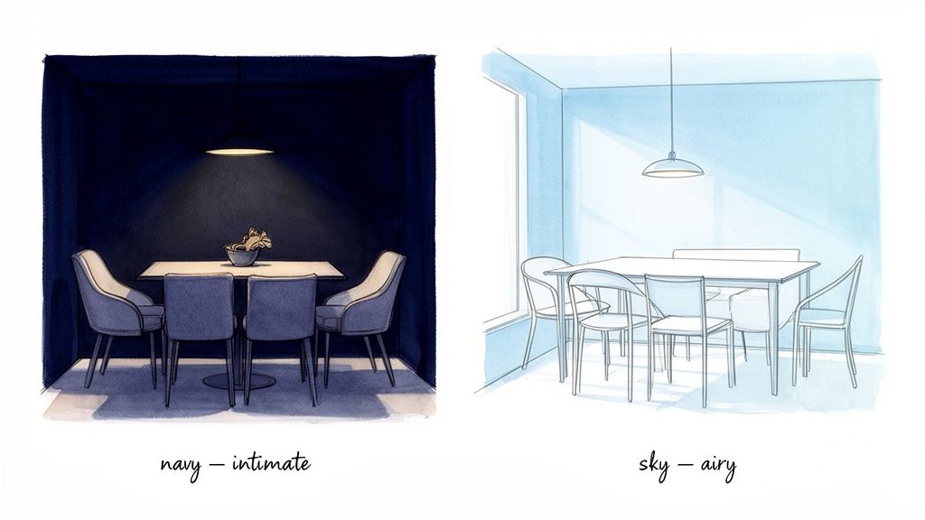
Picking a color for your dining area is really about setting a mood. Blue is fantastic at this because it brings a sense of tranquility and stability to a room meant for connection. Why does this matter? For a space designed for gathering, a calming color helps everyone relax and connect more easily.
The right shade can completely change the energy of your space. A deep, inky navy can wrap a room in a cozy elegance, perfect for long evening meals. On the other hand, a light sky blue can make a small, dark dining nook feel instantly brighter and more open—a huge plus for apartments or homes with limited natural light.
Unmatched Versatility for Any Style
One of the best things about blue is its incredible adaptability. A blue dining room can serve as the perfect foundation for so many different design styles, which means you won't get tired of it in a few years.
- Coastal and Relaxed: Think soft, watery blues paired with natural wood and crisp white accents. It creates a breezy, inviting feel. If this is your vibe, you can find more inspiration with these nautical interior design ideas.
- Modern and Sophisticated: A bold cobalt or a rich navy can create a stunningly dramatic backdrop for sleek furniture and gleaming metallic finishes.
- Traditional and Timeless: You can’t go wrong with a classic Wedgwood or a dusty French blue. They create a refined, elegant setting that feels both historic and completely fresh.
For homeowners, real estate agents, or Airbnb hosts, this versatility is a huge advantage. A beautifully designed blue dining room has broad appeal, boosting a property's listing appeal without polarizing potential buyers or guests. It makes a home feel thoughtful and memorable.
Of course, visualizing how a color will actually look in your space is crucial. This is where an AI Interior Designer can be a game-changer. Just upload a photo of your dining room, and you can instantly test out different shades of blue, helping you avoid an expensive mistake and choose your perfect color with total confidence.
Finding Your Perfect Shade of Blue
Choosing the right blue can feel like a huge commitment, but it’s simpler than you might think. It all boils down to two things: the mood you want to create and the unique qualities of your dining room, especially its natural light.
The way light shifts throughout the day can completely change how a color feels on your walls. A blue that looks soft and inviting in the morning sun might feel gloomy by dinnertime. This is exactly why grabbing a tiny paint chip at the store is never enough. You have to see the color live in your own space.
Understanding the Blue Families
To get started, let’s break down the world of blue into three main families. Each one brings a distinct energy to a dining space, making it easier to match a shade with your vision for the room.
Light Blues (Sky, Powder, Robin's Egg): These airy shades are miracle workers for smaller or darker dining rooms. They bounce light around, making a space feel instantly larger and more open. If your dining area is a cozy nook or part of an open-concept layout, a light blue creates a wonderful sense of expansion without feeling cold.
Mid-Tone Blues (Cerulean, Cornflower, Periwinkle): Think of these as the friendly, versatile blues. They offer more character than a pastel but without the heavy drama of a dark shade. A dining room in a mid-tone blue feels sociable and stylish—a fantastic choice for a room that hosts everything from weeknight family dinners to lively get-togethers.
Dark Blues (Navy, Indigo, Midnight): For a dose of drama and intimacy, nothing beats a dark blue. These shades create a sophisticated, cocooning atmosphere that’s perfect for evening entertaining. In a larger dining room, a deep navy can make the space feel more grounded. Don’t be afraid to use them in smaller rooms, either! A dark color can actually blur the corners and create a surprisingly expansive, jewel-box effect.
Choosing the Right Blue for Your Dining Room's Vibe
| Blue Shade Family | Mood & Vibe | Best For... | Practical Tip |
|---|---|---|---|
| Light Blues | Airy, Fresh, Calm, Expansive | Small rooms, spaces with limited natural light, breakfast nooks, coastal or farmhouse styles. | Pair with crisp white trim to maximize the light-reflecting effect. |
| Mid-Tone Blues | Welcoming, Balanced, Sociable | Versatile for most room sizes, family dining areas, transitional or modern decor. | These shades are forgiving and pair well with both light and dark wood tones. |
| Dark Blues | Dramatic, Intimate, Sophisticated, Cozy | Formal dining rooms, evening entertaining, creating a "jewel box" effect, traditional or eclectic styles. | Use accent lighting like sconces or a dimmer on your chandelier to control the mood. |
Ultimately, the goal is to find a shade that not only looks great but also supports the way you live and entertain in the space.
Visualize Before You Commit
The biggest fear is always painter's regret—that sinking feeling when you finish a room and realize the color is completely wrong. This is where a little bit of tech can be your best friend, saving you time, money, and stress.
With an AI Interior Designer, you can upload a photo of your dining room and see it painted in dozens of different blues in seconds. Compare a dramatic indigo against a soft powder blue and see how each one interacts with your existing furniture and flooring. It takes the guesswork out of the process.
For a deeper dive into testing colors like a pro, our guide on how to choose paint colors for rooms offers even more practical tips. Combining these methods with modern visualization tools gives you the confidence to finally pick that perfect blue.
Building a Cohesive Color Palette
Once you’ve locked in your perfect blue, it’s time to build the rest of the color palette. This is what will make your dining room feel truly intentional and pulled together. Think of the blue as your main character; the supporting colors in your palette make the story interesting, adding depth and personality so the space doesn't feel flat.
Designer-Approved Color Combinations
You don't have to reinvent the color wheel. Most stunning dining rooms rely on classic combinations that just plain work. These are a few reliable palettes that always look incredible with blue.
Classic & Crisp (Blue + Bright White + Warm Metals): This is a timeless choice for a reason. Imagine sharp, white trim against a deep navy wall—it’s an elegant and fresh contrast. The magic touch? Adding warm metals like brass or bronze through your light fixture or picture frames. This instantly balances the coolness of the blue and adds sophisticated warmth.
Earthy & Grounded (Blue + Natural Wood + Cream): If you're aiming for a calming, organic dining room, this is your go-to. The warmth of natural wood—whether it's an oak table or a walnut sideboard—provides a beautiful, earthy counterpoint to cool blue walls. Soften the look with creamy beiges in your rug or chair upholstery for a cozy, inviting atmosphere.
Bold & Modern (Blue + Orange or Mustard Yellow): Ready for something energetic? Look directly across the color wheel from blue to its complementary color. A strategic pop of burnt orange or mustard yellow creates a dynamic, high-contrast look. The key is to use these accents sparingly—think artwork, throw pillows on a dining bench, or a statement vase.
Visualize Your Palette Before Committing
Talking about color schemes is one thing; seeing them in your actual room is completely different. This is the point where you can sidestep expensive mistakes and decision fatigue.
An AI Interior Designer lets you upload a photo of your dining room and instantly apply different color combinations. You can see how brass fixtures actually look with your chosen navy walls or test whether a pop of mustard yellow feels right for the space. It’s a completely stress-free way to validate your ideas before you spend a dime.
To help narrow things down, this simple decision tree can guide you toward the right blue based on your goals.
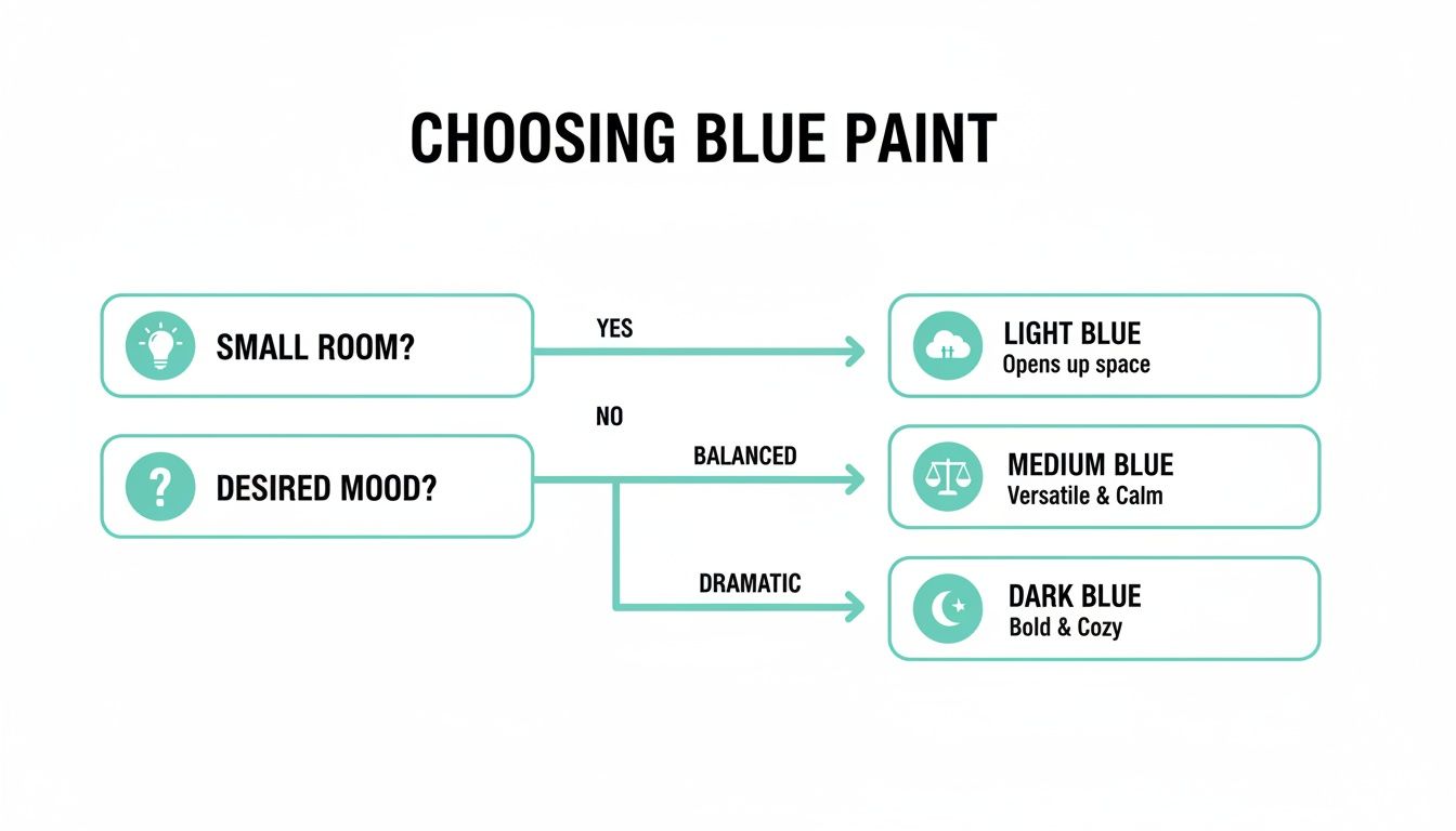
The flowchart shows how the size of your room and the mood you want to create can point you to the ideal shade—from light and airy for smaller spaces to deep and dramatic for a formal, cozy feel. If you're looking for more ways to organize your vision, check out our guide with inspiring interior design mood board examples.
Selecting Furniture and Materials That Complement Blue
Once your perfect blue is on the walls, it’s time to bring the room to life with furniture and materials. This is where you layer in texture, warmth, and your own personality. The key here is balance—cool blue tones sing when paired with warm, natural elements.
Warm woods and blue are a classic, can't-miss combination. A sturdy oak or rich walnut dining table immediately becomes the heart of the room, adding an organic, grounding feeling that keeps cool blues from feeling too chilly. If you've chosen a dark navy and are worried about the space feeling heavy, opt for a lighter-toned wood like maple or ash for your table and chairs to instantly lift the mood.
Choosing Materials That Add Depth
Beyond the big pieces, the smaller details in texture and finish are what truly make a design feel complete. You can get some great ideas from these wood furniture and material selection tips to help you get started.
Here are a few material pairings that work beautifully in blue dining rooms:
- Jute or Sisal Rugs: For a relaxed, coastal vibe, a natural fiber rug introduces fantastic texture and doubles down on that warm, earthy contrast. Plus, they're incredibly durable—a big win for a high-traffic dining area.
- Brass or Gold Accents: The warm glow of brass is stunning against deep, moody blues. Whether it's on a chandelier, cabinet pulls, or a mirror frame, it adds an instant touch of modern luxury.
- Matte Black Finishes: For a sharper, more contemporary or industrial look, matte black creates a crisp, graphic contrast that really makes any shade of blue pop.
Pro Tip: Don't be afraid to mix your materials! A rustic wooden table paired with sleek metal chairs and a sophisticated brass light fixture creates a dynamic, layered look that gives the room unique character.
See It All Together Before You Buy
It can be tough to visualize how a dark walnut table will really look in your room compared to a light oak one. This is where technology can save you from guesswork and potential buyer's remorse.
Using an AI Interior Designer, you can upload a photo of your blue dining room and start playing. Instantly swap out a marble-top table for a wooden one, or see how brass light fixtures change the entire vibe. It’s a simple step that helps you make choices with confidence, avoiding the cost and headache of a purchase that doesn't feel right. For more ideas on different aesthetics, our interior design styles guide is a great resource.
Lighting and Styling Your Blue Dining Room
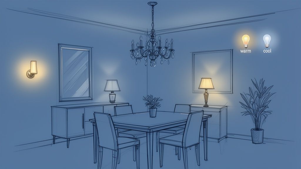
This is where the magic really happens. Lighting and styling are the final layers that transform your space from just a "blue room" to a thoughtfully designed dining experience. Think of lighting as the director of your room's mood. A single overhead light won't cut it; you need to layer lighting to add depth and make the room functional.
Start by anchoring the space with a statement chandelier or a striking pendant light over the dining table. This becomes a focal point while providing the direct light you need for meals. From there, add softer, ambient sources like wall sconces or a chic lamp on a sideboard to cast a gentle, flattering glow and eliminate harsh shadows.
The Overlooked Detail: Light Bulb Temperature
Here's a pro tip that can make or break your design: pay attention to the temperature of your light bulbs. This single detail can completely change how your blue walls look and feel.
- Warm White (2700K-3000K): This is almost always the right choice for a dining room. It creates a cozy, restaurant-like ambiance that makes both people and food look great. It enhances the richness of deep blues and brings a soft warmth to lighter shades.
- Cool White (3500K-4100K): Generally better for functional spaces like kitchens, this can feel a bit clinical for dining.
My best advice? Install a dimmer switch on your main light fixture. It's a relatively small, affordable change that gives you ultimate control. You can have bright light for a daytime brunch and then dial it down to a soft, intimate glow for a dinner party.
Styling With High-Impact Accessories
With your lighting sorted, it’s time for those final, personality-driven touches. Great styling isn't about clutter; it’s about a few carefully selected pieces that pull the whole look together.
A large mirror is incredibly effective in a blue dining room. When hung opposite a window, it bounces light across the room, instantly making the space feel larger and brighter. And of course, artwork is the perfect way to tie your entire color palette together.
Finally, bring in some life. A bit of greenery from a houseplant or a bouquet of fresh flowers prevents the room from feeling too static. You can find some beautiful vases to elevate your home that act as sculptural elements. If you lean towards a curated, less-is-more approach, our guide to minimalist room designs has plenty of inspiration. These simple additions are what make a space feel polished and lived-in.
Common Design Mistakes to Avoid
A blue dining room can be stunning, but working with a statement color means navigating a few potential design traps. The good news is they are completely avoidable with a bit of foresight.
One of the most common missteps is picking a blue that ends up feeling too cold. A beautiful gray-toned slate blue in a north-facing room with little natural light can quickly become sterile and uninviting. Another classic mistake is forgetting about lighting. Dark navy walls are gorgeous, but without layers of light—pendants, sconces, and lamps—that cozy retreat can feel more like a cave.
The "One-Note" Blue Room
I often see designs that feel flat because everything is too matched. When the walls, chairs, and rug are all nearly the same shade of blue, the room loses its personality and depth.
The key to avoiding this is to think in layers.
- Play with Tones: If you have dark navy walls, bring in a lighter sky blue for the upholstery or find artwork with pops of cerulean.
- Bring in Texture: This is non-negotiable for adding depth. Think about the feel of a woven jute rug, the softness of velvet chairs, or the organic warmth of a rustic wood table. These elements break up the solid color.
- Inject Some Warmth: Cool blues need a counterbalance. Warm metals like brass or bronze in light fixtures and hardware will make the space feel instantly more balanced and luxurious.
It's also worth remembering that color can subtly influence how we feel about food. Some studies suggest strong blue light can cast an unflattering tone on a meal. This is where that warm, layered lighting really proves its worth, ensuring the dining experience is always welcoming. You can read more about how color psychology plays a role in dining spaces on WebstaurantStore.com.
The best way to sidestep these issues is to see them before they happen. This is where a quick visualization can be a lifesaver. Using an AI tool to preview how a specific shade of blue will actually look with your room’s unique lighting can flag a problem long before you ever buy a can of paint.
Answering Your Blue Dining Room Questions
Even with tons of inspiration, it’s normal to have questions before you start painting. Let's walk through some of the most common concerns to help you feel confident about bringing blue into your dining space.
Can a Blue Dining Room Work in a Small Apartment?
Absolutely! The key is all about the shade you choose. Lighter tones like sky blue or a soft powder blue can actually make a compact room feel more open and airy.
If you're in a rental or have a small dining nook, consider these realistic options:
- Paint an Accent Wall: This is a fantastic way to introduce a bold color without overwhelming the space or violating a lease agreement.
- Focus on Furnishings: A set of upholstered dining chairs in a striking cobalt or teal can become the room's centerpiece.
- Use a Large Rug: A statement rug can anchor the space with your chosen hue without touching the walls.
- Add a Mirror: Placing a large mirror opposite a window is a classic designer trick that bounces light around, creating an illusion of depth.
What Interior Design Styles Go Well With Blue?
This is where blue really shines—it’s incredibly versatile and can slide into almost any design aesthetic.
For a moody, sophisticated vibe, deep shades like navy are perfect for Modern and Art Deco-inspired rooms. Lighter, dustier blues feel right at home in relaxed Farmhouse, airy Scandinavian (a style known for simplicity and natural elements), or timeless Traditional settings. And of course, blue is the foundation for any Coastal or Hamptons style.
Is a Blue Dining Room Going to Go Out of Style?
While certain "it" shades might trend for a season, blue itself is a true classic. A rich navy blue is a design staple, just like black or white, and it's highly unlikely to ever feel dated.
If you want to ensure your design has real staying power, focus on pairing your blue walls with classic furniture and timeless neutral elements. This ensures the room can evolve with you over time. Remember, AI can help you visualize these ideas, but it's best to combine those suggestions with your own personal taste for a truly timeless result.
Ready to stop imagining and start seeing? Instantly reimagine your room from a photo or sketch with Interior Redesign AI. You can see how different blues and styles look in your space, taking the guesswork out of the equation so you can design with total confidence. Try it now at Interior Redesign AI.